I’ve seen quite a few charts and graphs comparing the US to different countries. Some of these countries have much smaller populations and different demographics. This is especially the case when looking at countries in Europe. Some countries are more similar to individual states. Like some EU member countries, we have states that are not experiencing the pandemic as severely as hot spots around the globe (New York, Italy, Spain and others).
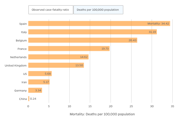
Nevertheless, I do think analyzing daily statistics overtime, like in a histogram is very useful. Such data can show whether we (as in a specific city, county, state, country) are “flattening the curve” or still trending upwards. Johns Hopkins University and Medicine has an incredible Coronavirus Resource Center, where you can view interactive maps and explore data visualization. I think their mortality chart of the most affected countries, presented using “Deaths per 100,000 population” illustrates the magnitutude of the situation in Europe.
I searched the internet for COVID-19 data science dashboards that could compare states to countries (like NY to Italy) or logical groupings (i.e. North America, Latin America, European Union, Middle East North Africa and so on). I did not see such a dashboard presenting such data or allowing users the ability to configure such comparisons. Before I get a wild hair to create such a dashboard, I decided to see how the US compares to the EU in terms of daily rates for confirmed cases and mortality. So, I downloaded today’s data from the European Centre for Disease Prevention and Control and played with it in Excel to produce the following charts:
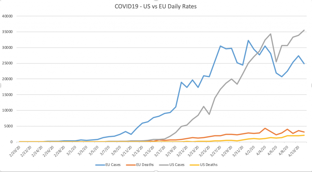
The first chart includes both confirmed cases and deaths. Assuming both are testing individuals at a similar rate, one could infer new cases are flattening in the EU and still climbing in the US. From my talks with clinicians in Europe and the US, I think using confirmed cases is a flawed and problematic variable for predicting if we are truly “flattening the curve”.
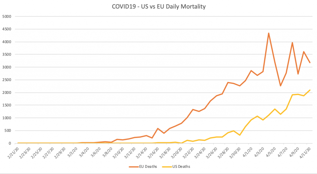
The second chart only looks at daily mortality rates. Clearly the EU combined has higher daily numbers, when looking at the same day. If we slide the US numbers in a month, the trend is very similar. With the up and down spikes in the EU starting at the beginning of April, we can only hope that we are starting to see a plateau emerge. Assuming the US trends similar to the EU, we will not see a plateau start to emerge until May, at the earliest.
I think the Institute for Health Metrics and Evaluation (IHME), which is an independent global health research center at the University of Washington, has done a stellar job at assembling epidemiological data as well as forecasting models for impact on hospital beds, ICUs and ventilators. I wish this data was available for doing side by side or within chart comparisons.
In short, there is a lot of good data and analytics on the internet. Much of the charts available raise further questions, which is a good thing for folks interested in data science.