This blog post is part of my Capstone Project for the IBM Data Science Professional Certification, offered via Coursera. I specifically documented some of the challenges and twists and turns that a lay person might encounter digging into publicly available data. This blog post consists of the following sections:
- Problem Statement
- Introduction
- Data Collection
- Methodology
- Results
- Discussion
- Conclusion
The python source code created is shared via GitHub and IBM Watson Studio. The choropleth maps are not viewable in GitHub, and are static image captures in this blog post. They are viewable with pop-up tool tips in IBM Watson Studio.
Problem Statement
My intent is to determine if publicly available data from Austin Public Health (APH) and Foursquare can help gain insights regarding the COVID-19 pandemic within Austin, TX. Having such information might be useful for immune compromised individuals and their families who wish or need to go out in public.
Introduction
As the husband of someone who is immune compromised, I have been following the SARS-COV-2 Coronavirus closely. This pandemic has captured, for good reason, the attention of the world. At the beginning of July, the total cases worldwide exceeded 11m, with around 6m recovered and over 500k deaths. Cases in the United States were leveling out or dropping throughout much of May, but many places (specifically in the south and southwest) experienced a major and sustained spike in June. One of the cities to experience this increase is my home town of Austin, TX. Some of the theories to this increase expressed by the media and others are:
- Texas’ economy opened up too early and quickly starting May 1st
- Lax Memorial Day celebrations may have occurred the weekend of May 23rd
- Problematic social distancing at protests starting the weekend of May 29th
As part of Texas’ first phase restaurants, retail outlets, malls and movie theaters were allowed to reopen at reduced capacity on May 1st. A second phase of re-openings, that included barbershops, hair salons, pools and gyms, quickly followed on May 8th. This second phase was supposed to happen later in May. Due to their proximity, it is highly unlikely these two phases can be distinguished from each other.
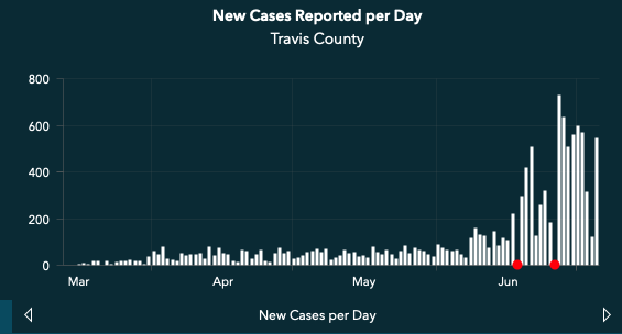
Looking at data gathered just after the 4th of July from APH’s “New Cases Reported per Day“, there was an initial up-tick of new cases on June 8th with spiking around June 19th and peaking on June 27th. It is important to note symptoms normally present in newly infected persons within 5-12 days after contact, and people in Austin are encouraged to get tested at symptom onset. I was personally able to get a drive up test on the same day as my tele-health appointment and received test results within two days.
Data Collection
My initial thinking was to look at what kind of neighborhood data specific data APH published on its website and what kind of data the City of Austin makes available from data.austintexas.gov. In addition, I also needed GEO JSON files for generating choropleth maps and interacting with Foursquare. The list of files used included:
- Austin COVID-19 Cases by Zip Code (CSV)
- Austin Area Zip Code Boundaries (GEO JSON)
- Foursquare API Results (JSON)
- Austin COVID-19 Complaint Cases (CSV)
Most of the COVID-19 dashboards and published datasets, like from Johns Hopkins University and University of Washington’s Institute for Health Metrics and Evaluation (IHME), tracks data at the country or state level. A few track further down to the county level, but there are very few with published data at the zip code/ neighborhood level. APH’s COVID-19 Surveillance Dashboard publishes the number of new confirmed cases by zip code. However this data is only viewable in a map widget and it presents only the most recently entered data. To better understand the affect of COVID-19 at the neighborhood level, having this data over time is necessary. So, I ended up manually creating this data from multiple sources, including an article from the Austin American Statesman newspaper. I captured this data in three groups: before Memorial Day Weekend, during second week of June and at the end of June.
The initial data I collected included confirmed cases from 40 zip codes in Austin, TX. I was unable to find data related to mortality and hospitalizations. I generated a bar graph to look at the zip codes that stood out. While there were zip codes that clearly stood out, it was hard to distinguish whether orders changed between periods or which zip codes had the lowest incidence. So I created a distribution dataframe to look at the ten zip codes with highest incidence by period and plotted the result.
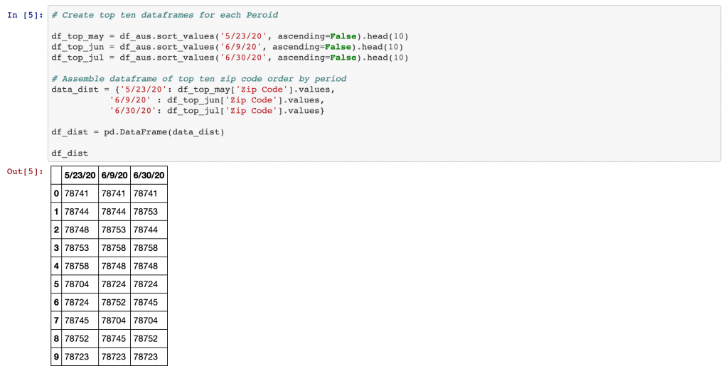
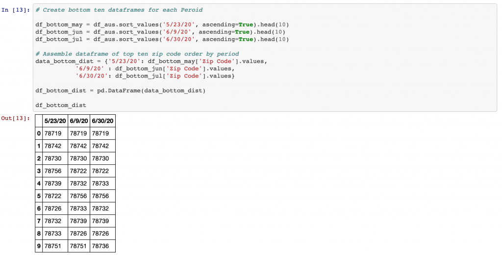
I also checked to see if the ten zip codes with the highest incidence were the same ten for each period. They were the same set, but the order changed slightly and 78741 remained at the top of the list with the highest number of incidences. The bottom ten was also relatively static, with the same three zip codes having the lowest incidence throughout each period.
Methodology
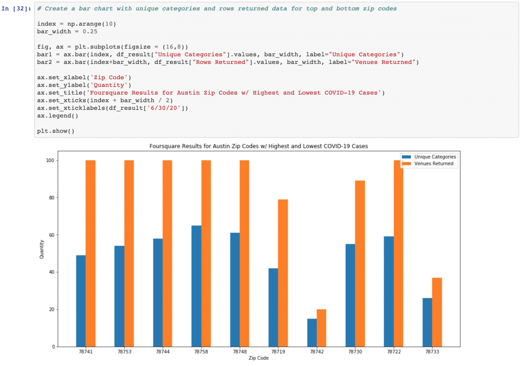
Once I was able to determine zip codes with the highest and lowest COVID-19 incidences by period, I wanted to see what further information I could glean from Foursquare and other City of Austin resources, specifically the aforementioned Complaint Cases CSV. I used Foursquare’s Get Venue Recommendations to pull down said information by zip code. Rather than pulling down all zip codes, I decided to focus on five zip codes with the highest incidence (78741, 78753, 78744, 78758 and 78748) and five zip codes with the lowest incidence (78719, 78742, 78730, 78722, and 78733).
I limited the request by zip code to 100 venues. Ideally, I was hoping to look at specific types of venues and see if I could find information on foot traffic within Foursquare. Unfortunately the Daily Stats Over Time method requires the user to be a Venue Manager, which I am not and decided not to reach out to individual institutions. Nevertheless, I could compare whether zip codes returned 100 venues or less, and the number of unique categories.
For the Austin COVID-19 Complaint Cases CSV, I looked at the overall data and the same set of zip codes used with the Foursquare queries. The CSV file included fields like type of business, type of complaint, opened date, zip code and longitude/ latitude information. I noticed there were zip codes that seemed to be missing information and there were complaints that were more prevalent than others. So a bit of data cleaning was necessary.
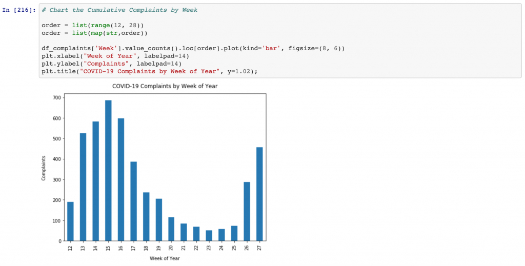
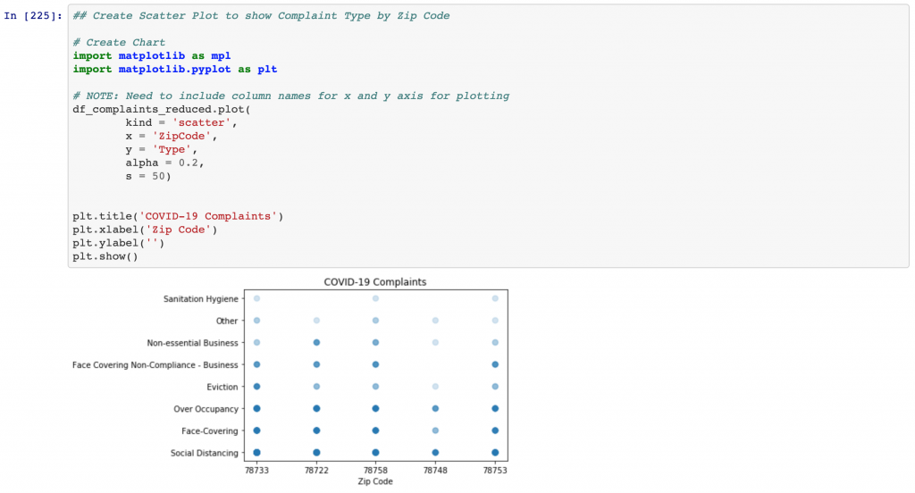
Ultimately, I produced a bar chart for number of complaints by week, starting in middle of March going to end of June/ beginning of July. I also produced a scatter plot for types of complaints using the top 5 and bottom 5 zip codes. Only five total zip codes were returned, two from the low incidence cohort and three from the high incidence cohort.
Results
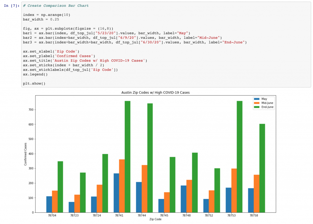
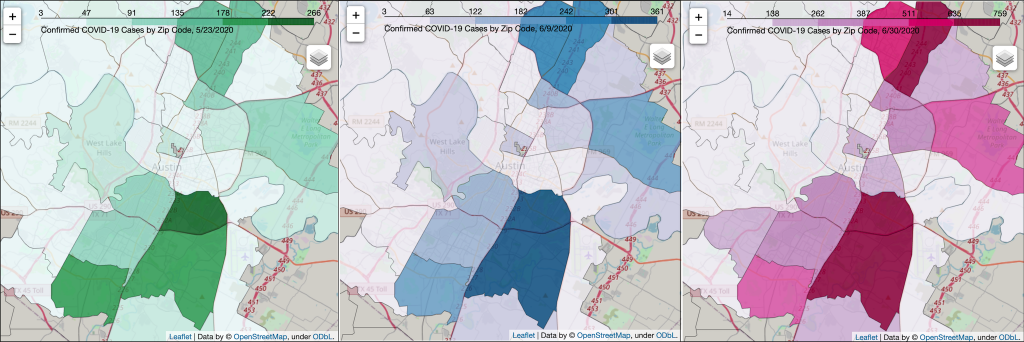
Ultimately there were multiple observations that can be gleaned by the data obtained and analyzed. Looking at the confirmed cases by zip code, Table 1, Table 2 and Figure 2, observations that are interesting include:
- None of the zip codes dropped out of the top ten incidence period
- Four zip codes stood out with very high numbers (78741, 78744, 78753 and 78758)
- Two zip codes shifted down two spots in June (78748 and 78704)
- One zip code (78753) climbed up a spot from each period to the next
- The riverside neighborhood (78741) has continually been at the top of each period
- High incidence zip codes are primarily in East, North, South and South East Austin
Looking at the Foursquare data and charts, see Figure 3, zip codes with high incidences of COVID-19 also had a larger number of venues. There are exceptions to this correlation, as 78722 returned a high number of venues, is next to the University of Texas campus, on the east side of IH-35 and is part of our low incidence cohort. Nevertheless, two of the low incidence zip codes have less than 30 venues. These two also had higher percentages of unique categories at 70% (78742) and 75% (78733). The other zip codes fell mostly between 50% and 65%.
As to the complaint cases, Figures 4 and 5, it seems that the complaints were largely flat for most of May through middle of June. Likewise, the types of complaints are mostly Social Distancing, followed by Face-Covering and Over Occupancy. There is no rise in complaint cases during the week tied to Memorial Day weekend or the Black Lives Matter protests. The increase in complaints noticeably increased during the week of June 21st, which coincides when local news and mainstream media were reporting about Coronavirus cases spiking.
Discussion
It seems evident the data publicly available via Foursquare and the City of Austin is inadequate for a lay person to delineate whether re-opening, lax gatherings or protests were the culprit for the recent Coronavirus spike. Without venue foot traffic data and contact tracing, it is hard to associate any change in patterns from one period to the next. It could be all of the above contributed to the incidence rise. Coupled with increased use of air conditioning, we get exponential growth. After all, we did go from day time mid 80s degree Fahrenheit weather in May to high 90s in June.
Nevertheless, we do see clearly that the high confirmed case zip codes have been clustering in the same regions of Austin. Some of these neighborhoods have different demographics with higher at risk populations and likely larger groups of individuals who are more exposed to the virus. Whether or why that is would take a more in-depth analysis that would require APH/ city resources.
If APH is conducting contact tracing, I hope they are looking closely at these top four zip codes. I think 78753 in North Austin is particularly interesting, as it was the only zip code in the top ten that moved up each period (from number four in May to number two by end of June). As of July 12th, 78753 has increased to 1,098 confirmed cases.
While further analysis of the complaint data is possible, it seems to be driven more by media hysteria than vigilance.
Conclusion
Ultimately, I conclude the choropleth zip code map that is regularly updated on the COVID-19 Surveillance, Travis County TX dashboard is adequate for residents to understand which neighborhoods are more affected by the virus. As of today, the high incidence zip codes are now each at over a thousand confirmed cases.
So as the spouse of an immune compromised person, I will not be venturing to places of business in those zip codes. Unfortunately, I have dear friends and family that live and work in these areas. So we will remain at a distance for quite sometime.
PS: I’m not a health practitioner or epidemiologist, nor do I play one on TV.