Back in April, I wrote a blog post titled Corona Virus Observations. The post was really a back of the napkin analysis of US versus EU daily case and mortality rates. It showed the US case rates were higher than the EU, but our daily mortality rate was still below the EU. This made sense as the EU was the virus epicenter at that time.
Two months has now passed and we are seeing virus incidence and mortality increases in Latin America, South Asia and Pacific Rim countries. So, I’ve decided to update my analysis using data science tools while clustering related countries into the following groups:
- European Union (Member countries like Austria to Sweden, excludes UK)
- North America (Canada, Mexico and US)
- Latin America (Central and South America, excludes Mexico)
- CANZUK (Canada, Australia, New Zealand and UK)
- South Asia (Bangladesh, Bhutan, India, Indonesia, Nepal, Sri Lanka and Thailand)
- Pacific (Australia, Brunei, South Korea, Japan, NZ, Philippines and Singapore)
Some of the CANZUK countries show-up in multiple groupings. Whether such a group has merit is debatable, but I was curious to see how they trended. Nevertheless, the graphs generated shows significant changes for multiple groups over the last four months.
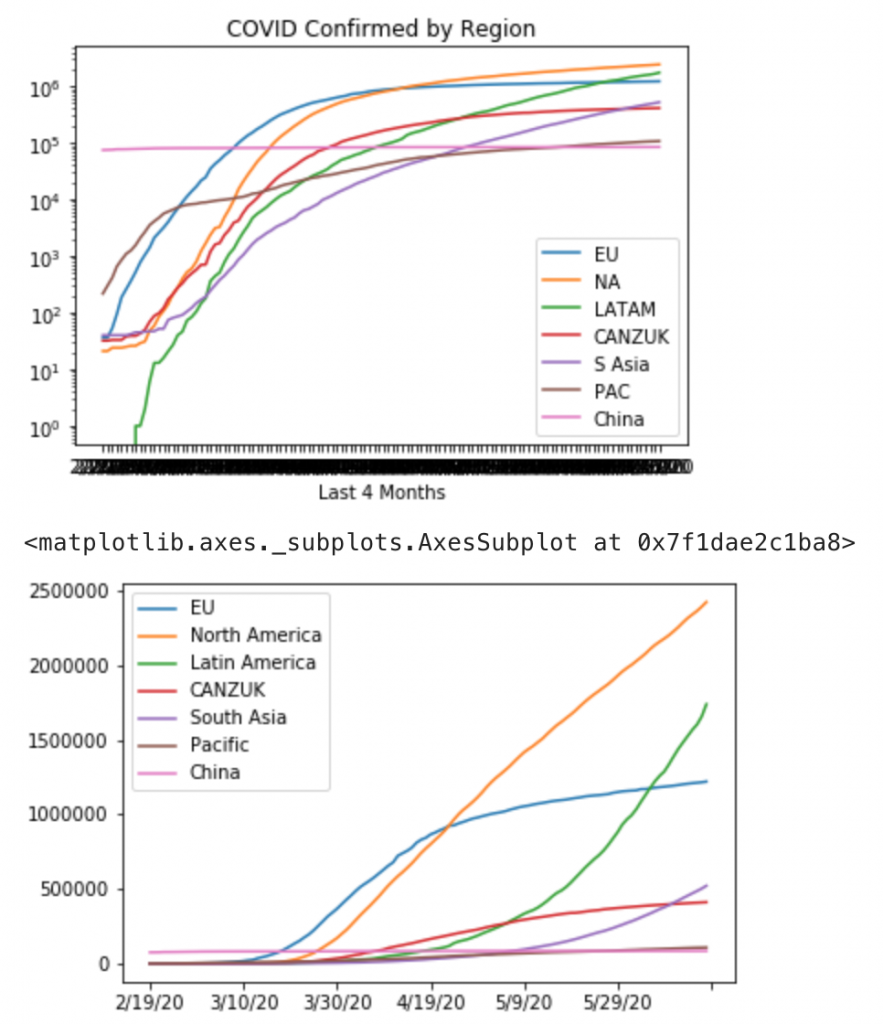
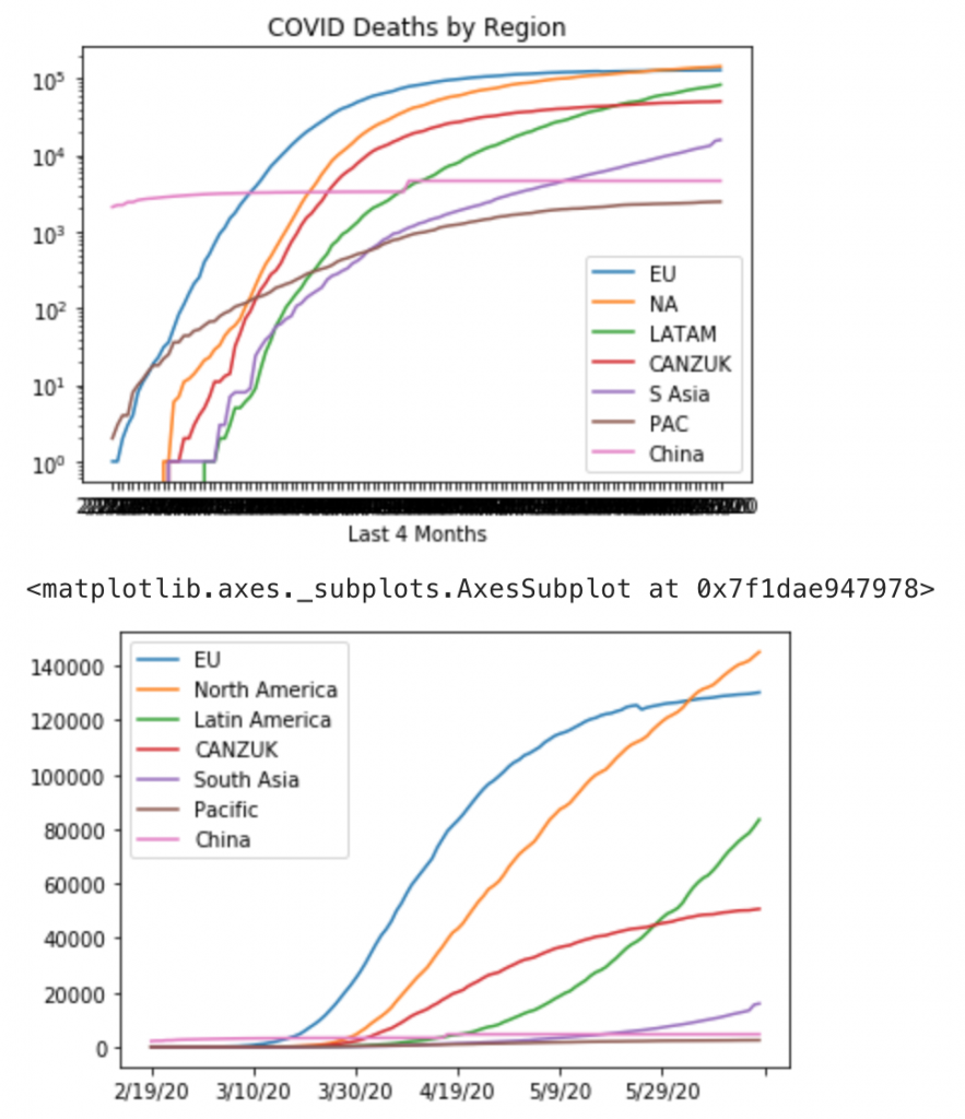
Back in April, I thought we were starting to see the beginning of a plateau emerge in the European Union. It seems later in May mortality there has also started to plateau. Sadly, North America has surpassed EU in mortality. Worse North America’s trajectory in terms of cases and deaths still looks linear. Just as troubling, Latin America has passed the EU in cases. I predict Latin America will soon see similar mortality numbers as the EU and North America.
A key indicator the virus is under some semblance of control will be when North America and Latin America start to plateau in both cases and mortality. At this point, the actual data is not promising such an inflection point will happen before the end of the northern hemisphere’s summer. Clearly the epicenter for the virus has now shifted to the Americas.
Additional Thoughts
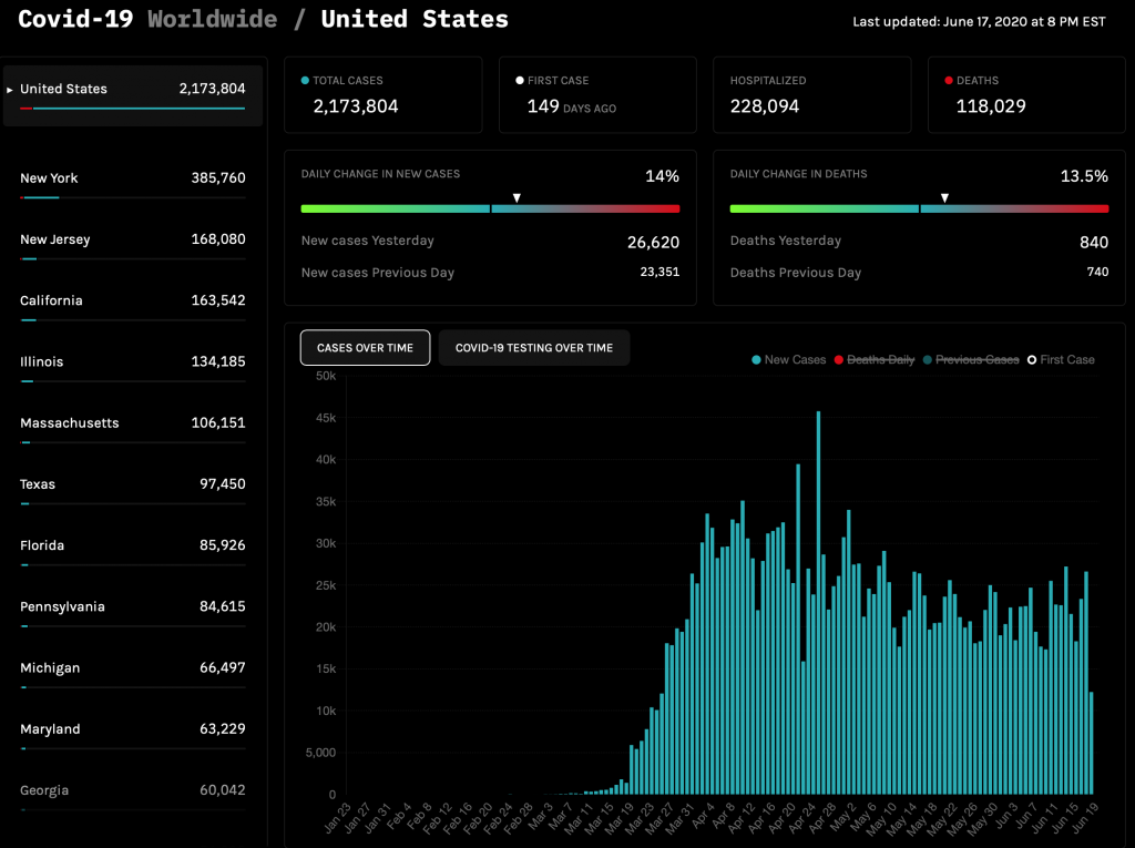
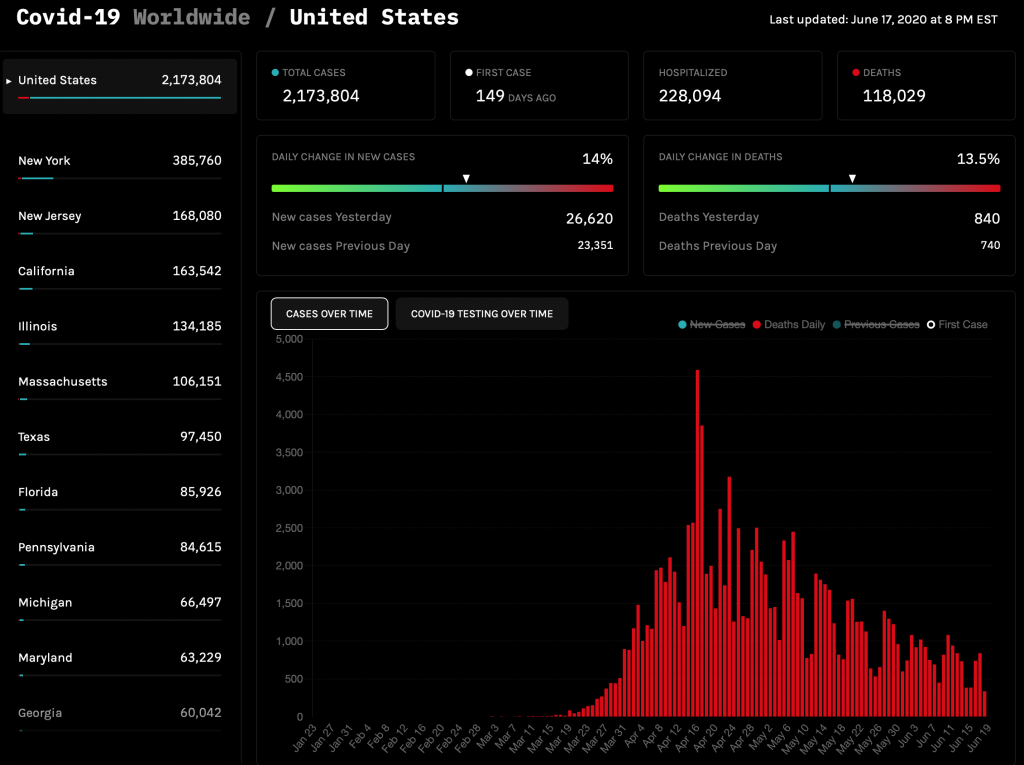
I think the above perspective is important to present, as most of the graphs we are looking at tend to focus on new cases and daily deaths. If we just look at the United States, we would be under the false impression the US is trending down. See the below example images from STATnews COVID-19 Tracker. In reality our cumulative cases and mortality is still growing, just not exponentially.
Going back to the Mortality Analyses by Johns Hopkins University, the observed case-fatality ratio compared to the deaths per 100k population paints a different picture as to who is experiencing the most pain to date.
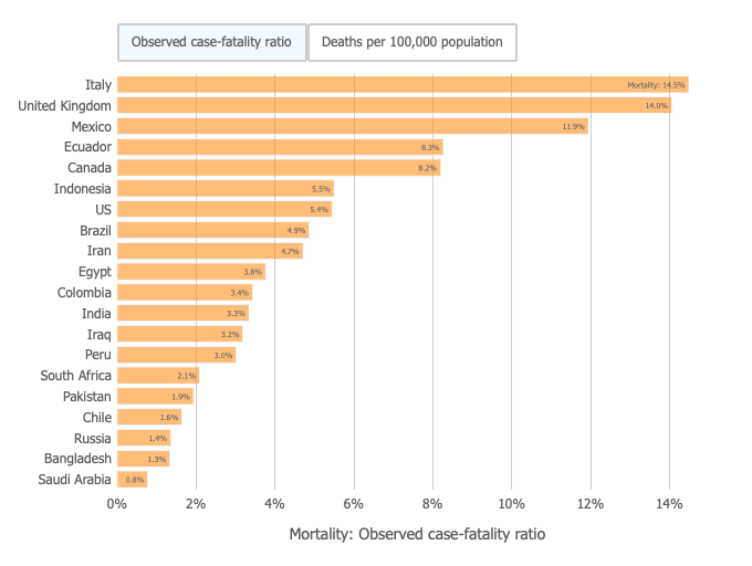
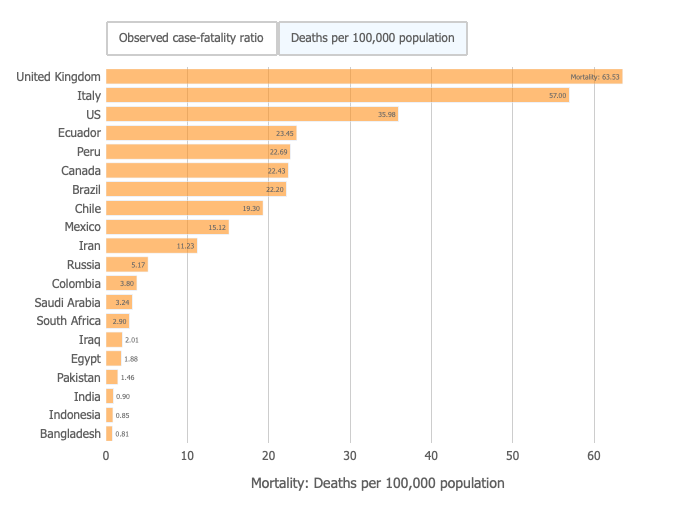
Back in April, see Corona Virus Observations, there were no Latin America countries part of the Johns Hopkins mortality analyses. It was dominated by the US, EU and Iran/ China. Now there are multiple Latin America countries in the top ten. Also it is worth noting that the US deaths per 100k population was 5.68 in April. Today our rate is 35.98.
I do wonder if we we are seeing good reporting in other regions, specifically South Asia and Africa. My hunch is we have a big blindspot in terms of testing and reporting, but that is for another blog post.